I have already looked at iconic album covers but to earn the status of "iconic" only comes with time so I will now take a look at some album covers of a selection of successful contemporary artists who cover a range of genres to compare and see what tips me & Suela can take away for our own cover and how it is representative of the artist. The artists I have chosen are all taken from the UK & International charts to contemplate their mass appeal as oppose to those bands with niche audiences who arguably rely less so on the marketing and image of their album cover...
Black Eyed Peas, "The E.N.D"
The fifth album from the Black Eyed Peas, titled, "The E.N.D", an acronym for The Energy Never Dies. The songs featured on the album have a very futuristic theme which is sustained to the album cover. In the video "Boom Boom Pow" this green model is featured so fans of the Black Eyed Peas can identify the image with the band. Using an image relating to the music video is something that Suela & I have definately considered for our digipack to sustain some continuity. With The E.N.D the band's logo is emblazoned across the forehead of the model and the green on black is a simple, effective tool for making the face the predominant focus and it's something alot of the iconic album covers used to make them stand out so they are not overly decorated.

Susan Boyle, "I Dreamed a Dream"
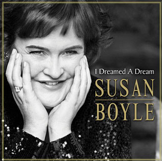
A successful product of Simon Cowell's reality machine. The marketing of Susan Boyle played a key part in elevating her success and her debut album cover would be the target focus that epitomised the image that she had portrayed to the public from the first time she stepped onto the stage for her Britain's Got Talent audition. The cover sees her in a glamorous sequined black gown which appears to act as a symbol for her "superstar" transformation whilst her coy "head-in-hands" stance and shy smile connote back to her humble beginings which will no doubt appeal to the millions that witnessed her journey from the begining. The image is another black&white shot which was probably chosen to make the gold font of her name stand out and, more likely, chosen to give the image a sense of timelessness. The frame around the image brings everything together to make it a successful album cover.
Taylor Swift, "Fearless"
The second studio album from American country pop artist, Taylor Swift was massively popular worldwide. The album artwork, however, was changed for International audiences. The American cover had a similar premise of her hair being swept back, only more ferociously and Swift is wearing a white dress and not looking at the camera. It conveys an image of an All-American strong young woman and the International cover does the same yet Taylor is looking directly at the camera with a look of self-assertion to perhaps show she is comfortable with who she is-aiding the "Fearless" title. I believe it was changed as Internationally, she is lesser known and not as established as she is in her home country so, despite this being her second album, this is their "official" introduction to her. The image is relatively wholesome and shows that she hasn't bought into the over-sexualised route to sell albums. It also works for appealing to her target audience as mothers would be likely to buy it for their pre-teen/teenage daughters and also maybe for themselves.

Kings of Leon, "Only by the Night"
The UK version of the massively successful Nashville four-piece rock band's fourth studio album depicts a hybrid of the bands faces and the features of an eagle to create a very direct, proud image. This is another image that relates to a music video. In this case the music vodeo, "Sex on Fire" follows the style of the washed-out green and the interception between the human and eagle eye. Their is a strong trend amongst contemporary album covers (which could arguably be applicable to album covers in general) to emblazon a face as the focus of an album cover-favouring the ratio of image over text. The font contributes to the theme and embodies the style that the album carries, not only artistically but lyrically.

Lady Gaga, "The Fame Monster"
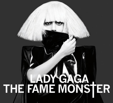
Within just over a year she has already become a recognisable institution within herself and it's clear by this album cover that she knows how to market it to her advantage. It's useful to consider that The Fame Monster is a evolution on her album The Fame, not a follow-up album. The Fame album cover depicts her face with her trademark blonde hair and huge dark bejeweled glasses covering half her face with "The Fame" sprawled across the bottom left hand corner of one frame. The dark, oversized seemed to be parodying their merit as the symbol of celebrity so with The Fame Monster, Gaga appears to play on that the other way round so the collar of her black leather trench coat covers her mouth in and her eyes are left staring right at the camera from underneath her platinum blonde hairdo. The image is black & white also which is fitting as Gaga has said it deals with "The darker side to fame"...hence, "The Fame Monster". We also see her from the waist up so she is more exposed despite being engulfed in an oversized coat. Against a dark grey backdrop allows the image to be the predominant focus and allows her trademark bleached hair to pop out more.

No comments:
Post a Comment